Introduction
Imagine building a house without a blueprint. That’s what the internet would be like without HTML (Hypertext Markup Language)—the invisible framework behind every webpage you visit. But here’s the catch: HTML was designed for desktop computers, not the tiny screens in our pockets. Let’s explore how this foundational language works, why it trips up on phones, and the mobile-friendly solutions that followed.
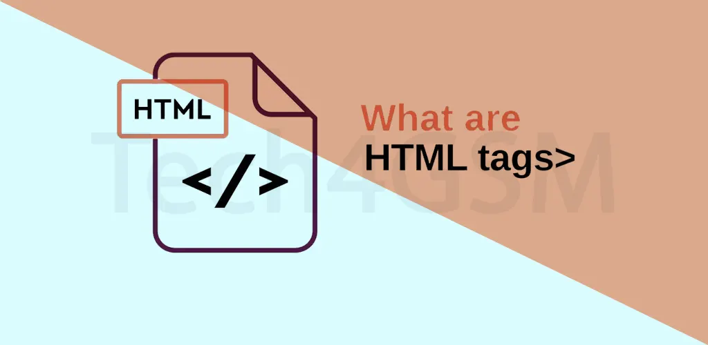
HTML Explained: The “Skeleton” of the Web
HTML is a coding language used to structure web content like text, images, and links. Think of it as digital LEGO blocks:
- Tags Define Elements: Use
<h1>for headings,<p>for paragraphs, and<a>for links. - Desktop-Centric Design: Created in the 1990s, HTML assumed users had large monitors, keyboards, and mice.
For example, a desktop site might show a wide navigation menu, but squeeze that onto a phone screen, and suddenly you’re pinching to read tiny text!
Why HTML Struggles on Mobile Devices
HTML’s desktop roots create headaches for mobile users:
- Awkward Layouts: Desktop-optimized pages appear squashed or require horizontal scrolling.
- Tiny Click Targets: Links/buttons designed for mouse cursors are hard to tap with fingers.
- Slow Loading: Heavy images and complex tables take longer to load on mobile data.
Ever tried filling a desktop-style form on a phone? It’s like threading a needle while riding a bike!
XHTML: The Mobile-Friendly Upgrade
To fix HTML’s mobile woes, XHTML (Extensible HTML) emerged in the early 2000s. It’s like HTML’s stricter, more organized sibling:
- Structured Code: Requires clean, error-free formatting (e.g., all tags must close).
- Better for Mobile: Works smoothly with early mobile browsers and smaller screens.
- Compatibility: Mixes HTML elements with XML rules for flexibility.
While XHTML improved mobile rendering, it wasn’t a perfect fix—developers still needed workarounds for diverse devices.
HTML vs. XHTML: A Quick Comparison
| Feature | HTML | XHTML |
|---|---|---|
| Syntax | Flexible, forgiving | Strict, XML-like rules |
| Mobile Support | Limited | Better optimized |
| Error Handling | Browser guesses fixes | Fails if code is messy |
Fun Fact: Many modern sites still use HTML but pair it with CSS and responsive design to adapt to any screen size—phones included!
How to Make HTML Work on Phones
While XHTML paved the way, today’s best practices include:
- Responsive Design: Use CSS to auto-adjust layouts for screens (e.g., stacking menus vertically).
- Mobile-First Approach: Design for small screens first, then scale up.
- Optimize Media: Compress images and simplify tables.
HTML’s Evolution: From Desktops to Dominance
Despite its quirks, HTML remains the web’s backbone. Over time, it’s evolved to address mobile needs:
- HTML5: The latest version (launched in 2014) supports video, animations, and offline browsing.
- Progressive Web Apps (PWAs): Blend HTML with app-like features for smoother mobile experiences.
Pro Tip: Always test your site on multiple devices—what looks great on a laptop might frustrate phone users!
Final Thoughts
HTML is the unsung hero that built the internet, even if its desktop-first approach clashes with our mobile world. Thanks to upgrades like XHTML, responsive design, and HTML5, we can enjoy seamless browsing anywhere. Next time you visit a site that just works on your phone, remember: it’s standing on the shoulders of HTML’s legacy.